"thinking about things" book

This time, I would like to share a conversation with Mario Mazzer, Italian architect and designer, currently an urban planner and an activist.

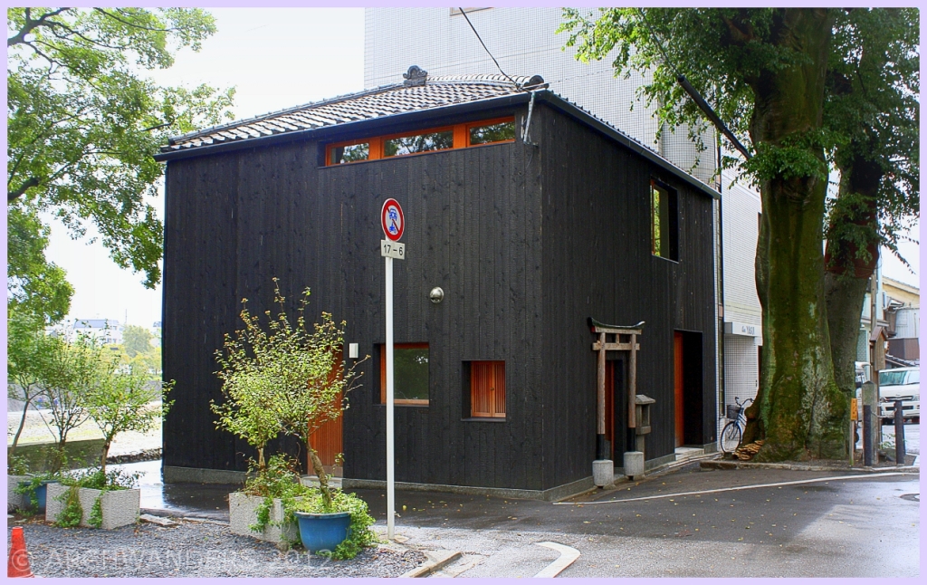
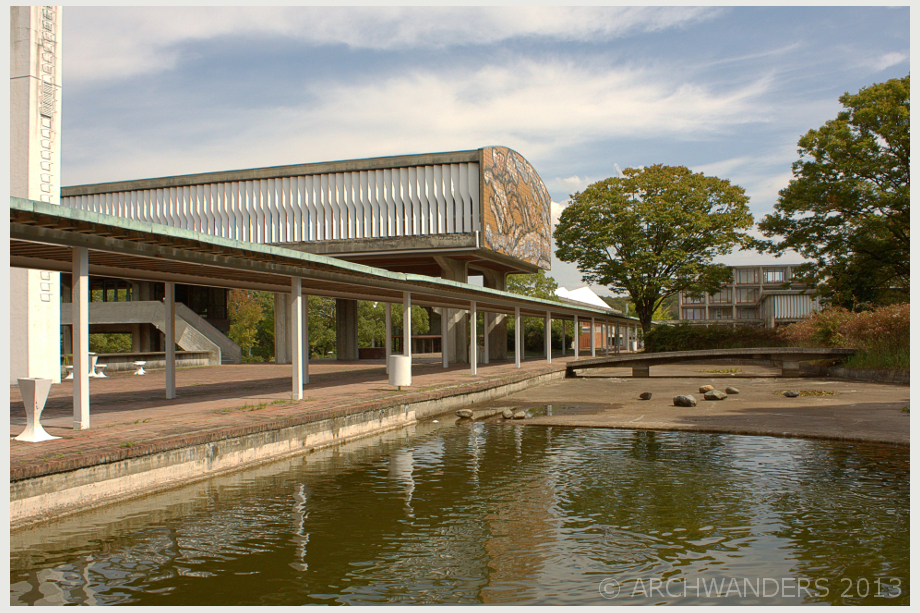
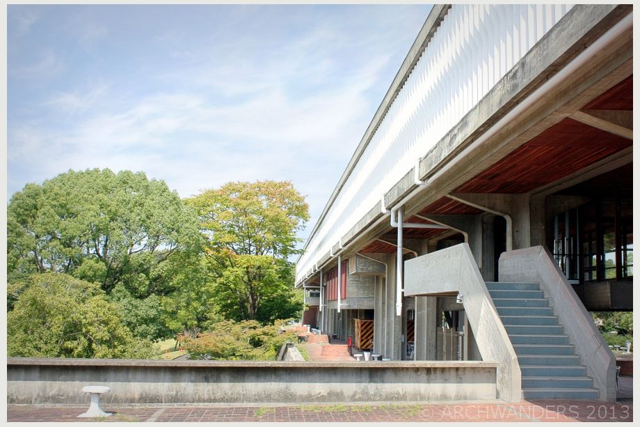
(You can see impressions and photos from one of Mario Mazzer’s buildings here: http://archwanders.com/2013/11/26/homes-headquarters-in-pieve-di-soligo-tv-italy/ )

On a bright October morning I come up the studio and enter the meeting hall what is on the top floor of Palazzo Montalban, located in an old town of Conegliano. All how it is supposed to be in the world class designer’s office – custom made furniture, special attention to stairs, every detail is unique. We sit down by a glass table and start the conversation.  I am intrigued and listen careful to the story that Mario Mazzer wants to share with me.

Architecture, it’s function and common problems around the world

Architecture is a way of changing how people live and think. Changing the lifestyle. It is so much more and deeper than just beauty, aesthetics or mere decoration.
I express my despair in terms of how difficult it is to really design, not that the design by itself is difficult, but getting the right idea across to the client and he scribbles something on the paper. What I see literally hurts me:

sketch replica of Mario Mazzer sketch
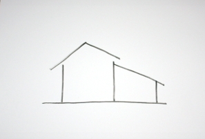
(replica of the sketch from memory)
I can only agree this is not an architecture and should be avoided at all cost. Yes, I say and not only that, but the paperwork is tedious and he nods in agreement, confirming that 90% of the architecture are some bureaucratic nonsense and only about 10% is the pleasure of creation.

To avoid the problem with design, the most important thing is to establish a good relationship with the customer and to show him or her the difference. The difference in the way that you are thinking, the difference that you can give in comparison with others. The value. Sometimes, he admitted, he has to say no  to some customers, in a case if he is not willing to listen and work together towards better result. In certain cases, he says, I must decline if the client is not willing to invest accordingly, for example a man purchasing a few million worth of a house should expect to spend a decent amount of money on interior as well, in order to have the same level and quality inside and out.  Also in cases if person is unwilling or unable to collaborate, see differently and is way too stuck in his old ways of thinking. A superficial decoration is never the way to go in architecture or design. And that is the loss of the customer, I could have given a lot.

Mario Mazzer tells me about the differences in working with Russian and Chinese clients. Sometimes might be difficult but in most of the cases both parties manage to arrive to a common agreement. Russian clients: long discussions needed, maybe some time to wait, let them think and arrive to common agreement. With Chinese, business-money, specific agreement comes first. Long and open discussions are however a necessity in any case.

The ways of working and company culture

We shortly discuss one Italian star architect, who’s name I’d rather not mention and how he has 50 people working for him on continues flow of international competitions and out of that number only 5 are payed. Mario Mazzer, on the contrast, is proud of paying all of his employees-I take this as a sign of high moral values. Especially considering the current situation in Italy and the fact, that around 30% of young people are unemployed.  Situation, I assume, being even worse in the architectural sector, it is very tempting to have “free” people. Myself, I must admit, some time ago considered such option for myself as soon as I become more established (maybe good thing, I didn’t). And unlike the mentioned star architect, Marrio Mazzer does not do competitions. What is fair enough: anyone with at least a slight and vaguely developed sense of logic knows, that the odds of winning in competing with other 300 architects are way too low. Investing a month of company’s work in something like this, is just not worth it.

Additionally the atmosphere in the office is democratic. I inquire about the the way design decisions are made:”is it from top-down?” and I get the answer: “we decide together”.

Personal impressions

Towards the end of the conversation I briefly spoke of myself who I am and what I try to do, and receive the comment: “Oh, so you are trying to be a polymath? <…> Do not stop”. I nodded and swore to all the forces of nature (and myself) to continue.

For a good-bye gift I received a book “Thinking About Things” – a story on his designs, the path up; story of things and and a way to design them. Latter-on after leaving the office, sitting down at the caffe and opening a random page in the book, I read the words by H. Hesse, that resonate deeply within me: “…I wanted to be something I wasn’t. I wanted to be a poet, but also bourgeois  It took me a long time to understand that both are not possible, that I am a nomad and not a farmer, a seeker and not a keeper. For a long time I prostrated myself before gods and laws which were false idols for me. This was my mistake, my torment, my part of the responsibility for the misery in the world. I added to the blame and torment of the world, because I practiced violence on myself.

General impression: I am surprised and in a slight shock – he is different! Different in a sense, that a lot of architects are arrogant and cold, but not him. I have met enough architects in my life and I mean especially the successful ones, who have had a trip on their egos alone and achieved what they have in life due to that. The kind of guys with  a permanent cold snarl on their faces. So generally I know what to expect: I came in with sort of mental preparation for a battle field, ready for some very high-level speech or even more – a test. But no, this is not the case: Mario Mazzer is humble and approachable.

I thank for the conversation and say good bye until the next time.

http://www.arecis.com

http://www.arecis.lt

Impressions and photo reportage from the visit to Homes headquarters:

The Homes Executive Centre is located in industrial area of Pieve di Soligo (Treviso). Desiged by award winning architect and industrial designer Mario Mazzer, the building was finished in 2009. There is no production in the complex: it accommodates the executive, sales, technical and administrative parts of five companies.

The volume of the entrance/ lobby intersects with the main building in an angle (non perpendicular way). This is not particularly visible from outside, but definitely adds to the play and quality of exterior and  interior spaces.

The front facade, view from the main street of the Headquarter Offices Homes Group:

Homes Executive Centre front side

Click image to enlarge

Active facade-passive building

The building features several special energy saving systems and according to the architect has won some awards for sustainability/innovation. The facade by itself allows high energy savings: the glass is of semi-active type, the glass is extra-light,  semi-active and is regulated by air extractors and curtains; it also provides a greenhouse effect in winter and a chimney effect in summer time.

The heating system uses the residue from machining carried out by the companies in the group; tele-heating is combined with condensation boilers. Cross-flow air treatment machines facilitate energy recovery and come with motors regulated by means of inverters (30% electricity saving).

From the distance, I assumed that the facade looks like it has a lighting system out, however upon a closer examination I find that the extra skin of the facade is a decorative feature consisting of open aluminum tubes.

Double facade close up:

FACTORY PIEVE DI SOLIGO FACADE FRONT SIDE5

Click image to enlarge

Popper detailing in and out

I observe, that the central staircase has been given a particular attention to. It is well detailed and has a feeling of a high quality built-in furniture rather than a part of a building.

Staircase in the lobby:

FACTORY PIEVE DI SOLIGO INTERIOR2

Click image to enlarge

From interior spaces I liked several moments: the ceiling/lighting design, it’s shape mimics the overall plan of the building. The top floor and the meeting rooms there features a wonderful view of the mountains in the distance and well maintained roof. Meetings rooms are subtly shaded for privacy by a fritted glass. Underground exhibition rooms are lit by natural light what comes in by a light tunnel.

It’s not all about the profits (or the aesthetics)

I am taken around the building by a friendly employee of the factory. She is most definitely proud of the place she works, her job, her big boss and is very happy to share some stories, what are interesting, even if architecture un-related. I am intrigued and amused to listen how wonderful it is to have a kindergarten in the building and I’m  cheerfully asked if I want to see the kids. I refuse in a slight chock,  how real life and the perfection of architecture are not necessarily connected. All I could notice, is how the colorful plastic elements spoil the purity of the back facade, and that raises the contradiction: isn’t the architecture supposed to be for the people?

Cantilevered end of the building, this side on the ground floor has a function of a kindergarten:

FACTORY PIEVE DI SOLIGO FACADE FRONT SIDE3

Dining area/canteen for the employees:

FACTORY PIEVE DI SOLIGO INTERIOR

Click image to enlarge

Additionally, I am told the story how nobody in the factory, despite the recession (and imagine in Italy!), have been laid-off. Apparently that is due to the hard work and the personal initiative of the owner of the factory. This story leaves me convinced, that the people here do their best and are super loyal to the company  As we speak here comes the lunch time and the workers from near-by building, what actually hosts the furniture production, hurry towards the canteen. In rush I take the last  few snapshots and leave the building.

Gallery, the rest of the images:

Barista Pro Shop, one from the chain of Streamer Cofee Company is a very unusual cafe. Situated in the district of Harajuku, Tokyo, Japan this building stands out due to it’s resemblance of a shipping container tilted vertically. I was not sure if it was a real shipping container used for the construction, but after a closer examination, I discovered  that it is only a design solution.

Barista Pro Shop container house tokyo

Click image to enlarge

Located on a small triangular plot, that used to be a parking lot, the ground floor of the building is merely 10 m². The idea behind the design of the shop is to show the manly and robust nature of string coffee by the use of steel walls, wood  and concrete. The 2nd and 3rd level temporarily hosts Armani concept store at this is a very upmarket fashion oriented neighbourhood.

There are benches provided outside as the building itself has a small footprint and not all the customers fit inside. The space provided is actively used: as visible in one of the pictures. During the day the plot was occupied by a professional photo-shooting.

More pictures of the Barista Pro Shop Harajuku:

Some images from recent findings in Hyderabad, India. The Birth Place Hospital, designed by Fountainhead architectural office.

The building is from 2013, still under construction. Part of he building is covered by translucent plastic panels and part of it by patterned façade panels.  It was very difficult to find true design in Hyderabad, this one was one of the few and  as close as it can get to quality design in this part of the world. This building does stand out from surroundings, I even tried to get inside for the pictures, however I was politely declined (the building still not finished).

This post is not about architecture as a beautiful object, and not even about pretty landscaping. But first a bit info about the building and then I will take you to the reason why this building has changed my life.

South view to the bridge dividing two parts of Nagasaki Prefectural Art Museum

I spent only one afternoon in Nagasaki, I was in the rush, but still that was enough to get very positive impression. The city is very different from other cities in Japan. It is more European and at the same time even more different. The urban planning is just great – while walking around I kept thinking to myself that many architects and planners (including some people, that I know) should be sent in to Nagasaki, to learn some important lessons they must have missed in their lifes.

View to the bay from the rooftop of museum

Landscaping nearby museum

Designed by Mr. Kengo Kuma and NIHON SEKKEI, Inc., opened in April 2005, the buildings won many prizes in building and illumination design competitions. Comprised of two buildings located across a canal from each other and connceted with a glass bridge. Interesting design feature – vertical louvers composed of approximately 12 000 square meters of Brasilian granite. The louvers give interesting and interactive dimension as you move-by.  However the best feature of  Nagasaki prefectural art museum is the wonderfully done landscaping, green rooftops what almost melt into the surroundings.

Views from roof-top terraces

After going down from the roof terrace, I was enjoying the view from bellow and then… Two girls dashed through the bridge: one in a wheel-chair and another pushing her. They were laughing very loud, they were so happy. It struck me like a lightning: the buildings do need to be accessible for everyone. Now, after some time has passed since my visit and the understanding has settled-in deeply. The understanding and idea behind accessibility seems natural now, but was not up to this scale until that afternoon in Nagasaki.

235

The building is open and truly accessible to everyone (at the time the opening hours were already over)

Girls on the bridge came back and forth at least 5 times giving me plenty of opportunity to photograph them. The joyful laughter still rings in my ears up to this day.

Often people (even designers) do not take this seriously at all, even public and important buildings do not have ramps, or any means of getting there at all. But someone needs to understand, that not every handicapped person is an old drunkard who got in to such state due to his own actions (a very common assumption in the region where I live now). I must admit may times the regulations concerning handicapped people used to be seen just as a nuisance. Who has ever seen a handicapped around, but maybe THAT is the reason they are not visible? I will never be frowning again for making an accessible building; to the contrary I have since became an active advocate of accessibility!

Some more images from and around the museum:

This time I will leave all the lovely mid-century buildings aside for a little while and tell you a story about a contemporary office building in Vilnius, Lithuania which has been built in 2012. Designed by Hackel-Kaape architekten office Hamburg-Vilnius with mainly Lithuanians on the team. This project also includes restoration of  1913 secession style merchant’s house originally designed by an architect M. Prozorov. New glass addition plays a contrast role in overall composition.

View to the new addition to the “Merchants’ club” from Lukiškių square

This building is just next to the most important Gedimino boulevard in the center of Vilnius. Due to the importance of location choosing the right project was by the means of a closed competition, what was held in 2008. Other competition entries can be seen here.

The sunny weather photos are taken in summer 2012, and in the beginning of this year I came back for more. The building looks much more cheerful in a sunny weather conditions, than in the middle of winter. In the competition entry of the architects the building was presented as a bit more pale, whiter glass would be used, however in reality it is even brownish. Even thought the construction is claimed to be finished in 2012, the office spaces are still not rented out – exactly the same add half a year latter is still there on the front window. I also assume, that within the deeper side of the building the construction is not over yet, as the courtyard is still not accessible for anyone and the construction fence is still there instead of a gate.

I would like to dedicate this article as a tribute to the architect with whose work I fell in love with – Akio Okumura (1928 – 2012 December 27th2012 ).

The University is located in a hilly area on the eastern outskirts of Nagoya. Established in 1966 the campus covers a large area of approximately 410,000 square meters, with University facilities blending harmoniously with the surrounding nature and greenery.  It is a third public art school build after the war in Japan.

modernist Aichi Prefectural University of Fine Arts and Music 16

View from the Faculty of Fine Arts drawing room to the Faculty of Music

The main architects who worked on the design were Junzō Yoshimura (1908-1997) who was credited for the design and  Akio Okumura who was a young assistant professor at the time and who actually did the main work.

I actually visited the site before the death of Akio Okumura. Upon retuning to the Europe I collected the facts and the details of the University and it’s design process. Back then, just a few weeks ago, there was scarcely any information about the works of Akio Okumura or the architect himself. Now, however the articles, stories and photos to be found on the web have at least tripled.

modernist Aichi Prefectural University of Fine Arts and Music 10

Lecture Building

Discovering the modernist gem:

Strange ways lead me to this place: one nice afternoon, when I was visiting Nagoya city, I decided to visit the most recommended tourist attraction in the region: the Toyota Automobile Museum. The means of getting there was on a specially made MAGLEV train, what is elevated from the ground on special tracks. When I got out of a train and took few shots of the tracks, that was it: a battery of a camera got flat. It automatically meant that we will not be going to the museum as what is the point of being there if you cannot take any pictures (a bit shallow, I know). Since the Toyota Automobile Museum is outside the city limits and it already took long time to get there, I started looking around maybe there is something else to see nearby. There was a sign on a street to an art university (university was the trigger word). As I had my research of architecture in Nagoya done prior going there, I assumed that this must be the Nagoya University, designed by the famous modernist Fumihiko Maki, a winner of Pritzker Prize. So without much hesitation off we went, in the back of my head I knew this was not the university I mentioned before, but I though “well you cannot go wrong, universities are always interesting”. And it resulted into the best unintended architectural finding ever! This university that I am showing to you now definitely is not the one I originally wanted to see, but latter-on I did visit and photograph the University of Nagoya (so please come back to check out my posts!).

The fist visit to Aichi Prefectural University of Fine Arts and Music left a deep impression on me. I had plenty of time to wander around the campus and enjoy the atmosphere. Being without a camera actually helped me to really be there. The day was cloudy, and in such weather modernist buildings look even more attractive than in perfect sunny conditions. I fell in love, understood and saw the ideas behind the buildings. The designer must have loved this design, something that architects know from their experience. There are sometimes designs that may not be perfect, but you just happen to feel unreasonably passionate about them. That night, before falling asleep, I was still walking around and seeing the Art University buildings with my eyes closed. I even do not think that has ever happened to me before, not with a building at least. I am not even sure that prior discovering these buildings I even liked modernist architecture at all…

Fragile moment in time or to be saved and appreciated?

Few weeks passed and I came back, and took the photos. No matter how much I photographed, it still feels it was not enough and I do not have enough shots of the wonderful details. I have a fear that the beauty and uniqueness might disappear forever, next renovation and all might be gone. All the wonderful tiles in interior, original furniture, handles, the spirit just might be gone soon. A state of the buildings is the best described as neglect, however this and assumingly a lack of money were the main factors that all has survived until this day.

At the time of my visit there were new buildings constructed next to the old campus. The new buildings were designed with the respect of the old style. As much as I could understand from different resources, the whole original campus will be renovated as well. But the renovation is not carried-on respectfully: the bathrooms that I first saw in Lecture Building were intact original ones (and yes pretty disgusting – squatting ones form the 60’s), later-on they were being renovated. However I could bet, that the process was done by just regular plumbers with no involvement or  advices from an architect. What if the management just changes all: little by little, first  “better” flooring, then “better” insulated windows, then, of course more “comfortable” seating, etc…

Some of the smaller buildings in the campus have been just left to decay on purpose, a tactic, described by local magazines as “sneak attack”. That means when the buildings become too unsafe and too expensive to renovate – there will be the easy way out as demolition strongly encouraged.

I can only hope that the death of the architect, albeit very sad, will be the trigger raising public awareness of the state of these buildings and the need to preserve them.

modernist Aichi Prefectural University of Fine Arts and Music 3

Original furniture and finishes in Lecture Building

Some facts behind the concrete, bricks and wood:

This campus has been designed with a view of nature conservation. Some endangered species live in this campus ground. Certain insects and flowers can be found what are listed in the Red Book of Japan. (I saw a huge green praying-mantis, surely not rare, but a first time for me to see this insect)

Akio Okumura was struggling a lot at the time and the design, he drew a tremendous number of drawings until he came to the final version of design.

Akio Okumura envisioned Aphrodite from “The Birth of Venus” by Sandro Botticelli, standing on top of a large shell when he designed the Odeum, or concert hall. However the usage of such symbols was very unusual for this architect, otherwise very scientific man.

modernist Aichi Prefectural University of Fine Arts and Music 22

Odeum or concert hall

The Lecture Building is lifted into the air, carrying a reminiscent of a museum, a linear building covered with white louvers, the building also is very symbolic.

The level of concrete detailing on Lecture Building is a piece of art, I do not think that anyone today could be bothered in making something like those elegantly curved columns.

modernist Aichi Prefectural University of Fine Arts and Music 1

Lecture Building of Aichi Prefectural University of Fine Arts and Music, view from the North

The Lecture Building acts as a central axis between the Faculty of Fine Arts and Faculty of Music on the west to the east. The different disciplines are connected with covered passage and one can gaze upon music faculty from plaster room or drawing room.

Plenty of traditional elements incorporated into the design, especially the overall landscaping and specific details.

To get a “perfect” perspective in photos I had to bend my knees slightly.

Full slide-show here (please enjoy!):

This time a bank building from Brussels, Belgium. It is one of the best examples of modernist architecture and one of the best known in the area (if you ask design related locals to recommend nice modernist building this will be the one).

Modernist bank building in Broekstraat 1

Prefabricated concrete pieces mounted together with the help of metal pieces and tension cables, make an intricate façade. The building looks contemporary enough, some designers nowadays copy the style, however the level of detailing and quality of execution is difficult to match. I can hardly imagine what building, built in recent years, will be looking at least ok, 50 years down the road.

Modernist bank building in Broekstraat 2

Very sculptural corner detail:

 Modernist bank building in Broekstraat 3

The building is in a very good condition, my guess is that concrete façade must have been cleaned-up recently.

Modernist bank building in Broekstraat 4

View from the street, Brussels as a permanent construction site (changes for the better, thought) :

Modernist bank building in Broekstraat 5

However and sadly my on-line search could not retrieve any information about the building nor who designed it. It would be great if anyone from the readers could tell me, if they happen to possess such information.

Koban or small Police Station designed by  Klein Dytham Architecture, located in Kumamoto, in the southern most island of Japan. Year of execution: 2011. Possibly the friendliest and most cheerful police station in the world (by it’s looks, at least).

After a new bullet train station was built in city of Kumamoto, the area around the station was made into a sand box for architects. The program is called Artpolis and is lead  by Toyo Ito, who was the one that commissioned this police station.

Big white circles on the top part of the façade allow pastel rainbow colours painted on the inner shell to shine through:

Koban police station in Kumamoto 1 Koban police station in Kumamoto 2

The external colour-coding of the station is a part of architect’s interesting ideas. For anyone living in Japan it looks like a Japanese police car: white top, black bottom and red lamps. Very clever design move.

Koban police station in Kumamoto 3 Koban police station in Kumamoto 4

Maybe the friendliness and playfulness of the Koban’s façade was that attracted a group of very friendly  school-kids, who really wanted to talk with me (I wish I knew about what) and photo-bombed some shots:

Koban police station in Kumamoto 5

Different colours of different shades are visible when you move around the station, that makes this building very dynamic.

Koban police station in Kumamoto 6

This part of the town has buried the power-lines and the sky of this whole area is power-line free.

Koban police station in Kumamoto 7

Good path to take and a perfect example for an institutional architecture.

The Music Academy MWD (Academie voor muziek, woord en dans Dil’arte) in Dilbeek, just out of Brussels city limits to the north west in the Flemish area of Belgium.

One of the most spectacular buildings I ever had a chance to see and visit! Designed by a Spanish architect Carlos Arroyo, with some Belgian members on the team. Construction finished and the building was opened for use in September 2012, competition won in 2007.

Generally this building seems to be a bit over the top, a dominant in the distance, precisely detailed, well sculptured shape, plenty of symbolism in the design and even with dynamic qualities as it changes from different angles!

Amazing cantilevered music academy MWD in Dilbeek

The building changes as you move along the façade: from the front, at a slight angle a forest is visible, then slowly more colours appear, and when you look back the building suddenly becomes different variations of blue. I love that the façade is on permanent summer, even if reality around it is Belgium winter. The forest pictured is Wolfsputten, a protected area of natural forest located just at the back of the plot.

Amazing cantilevered music academy MWD in Dilbeek 1 Amazing cantilevered music academy MWD in Dilbeek 2 Amazing cantilevered music academy MWD in Dilbeek 3 Amazing cantilevered music academy MWD in Dilbeek 4 Amazing cantilevered music academy MWD in Dilbeek 5 Amazing cantilevered music academy MWD in Dilbeek 6
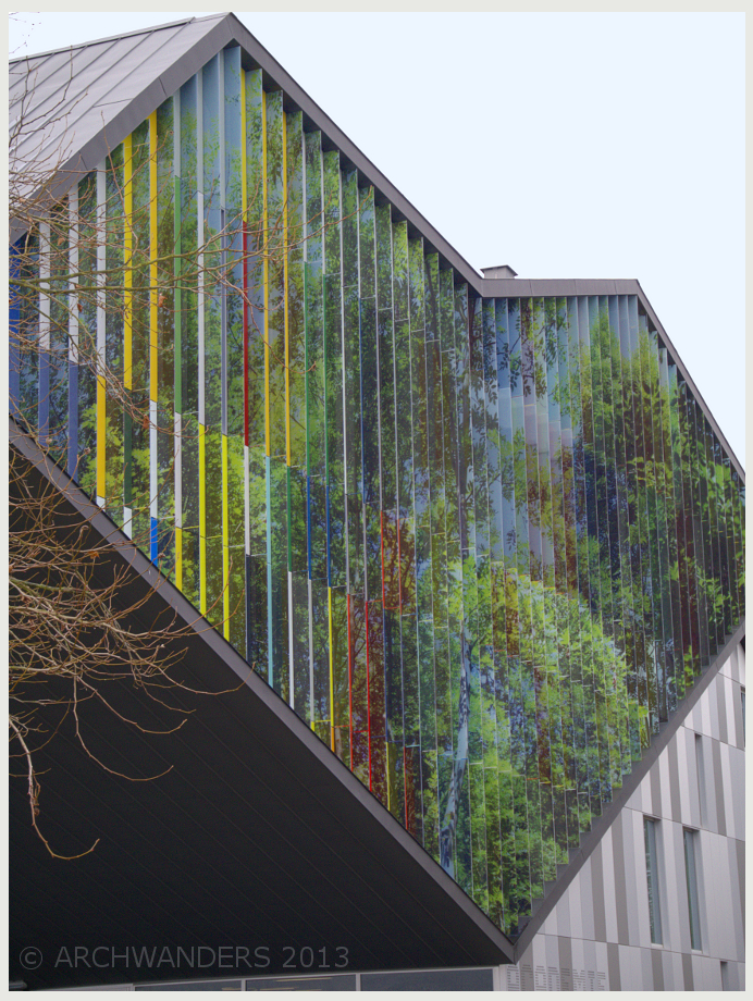
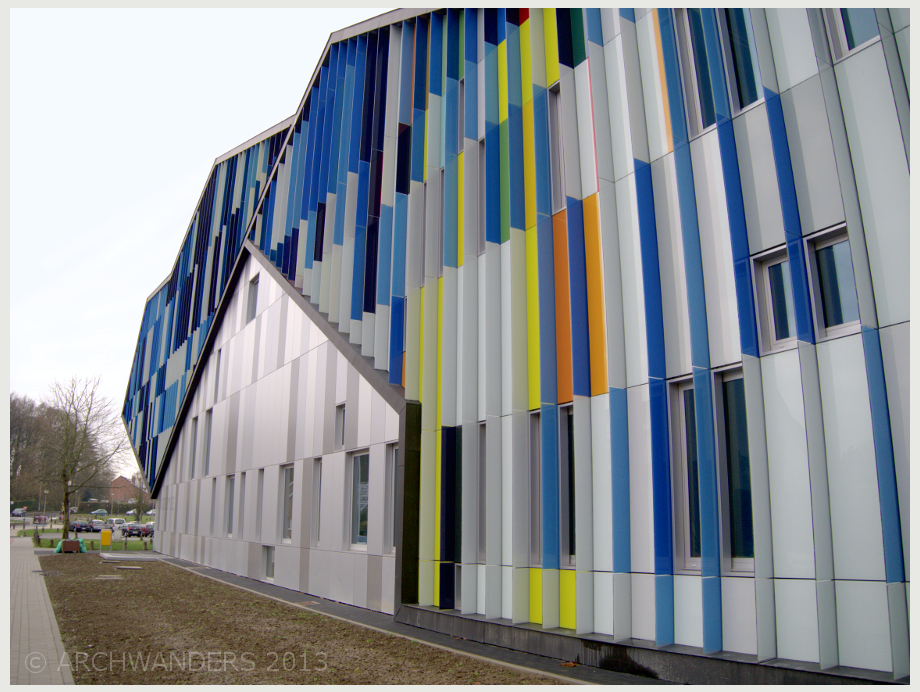
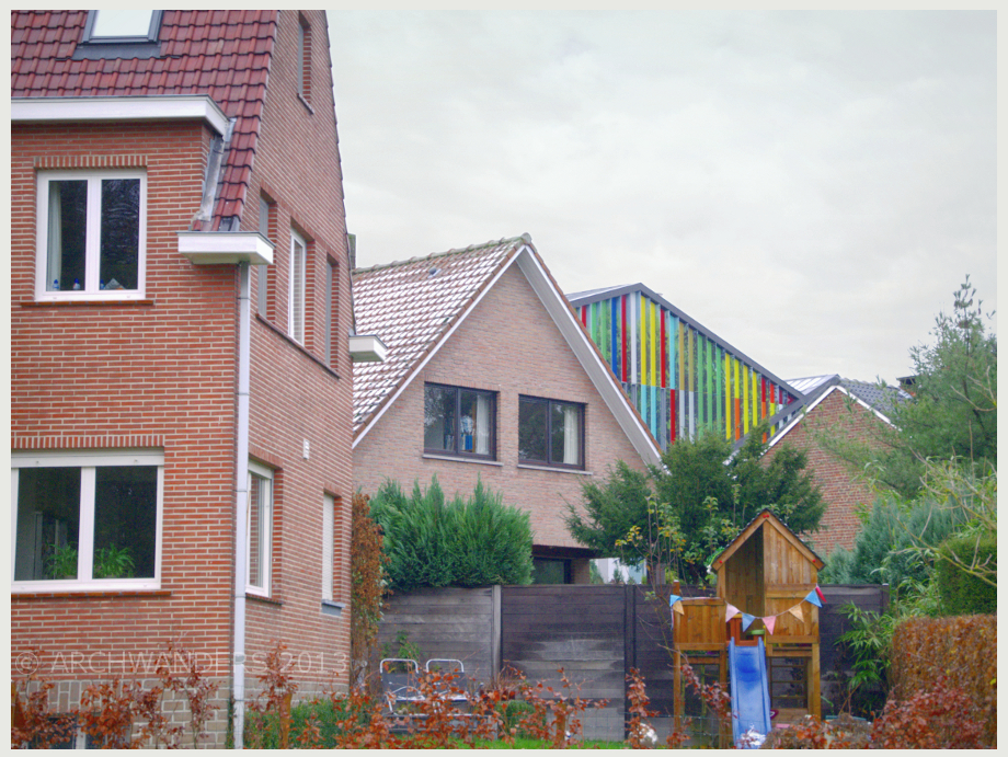
I cannot shake off the idea of cycling back and forth many times and watching this façade changing.
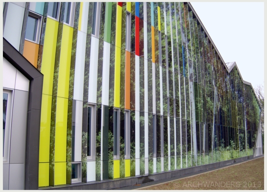
Amazing cantilevered music academy MWD in Dilbeek 7 Amazing cantilevered music academy MWD in Dilbeek 8 Amazing cantilevered music academy MWD in Dilbeek 9 Amazing cantilevered music academy MWD in Dilbeek 10

Architect himself clams that the idea behind the coloured louvres was influenced and designed as a piece of music (Canon for 36 voices by Johannes Ockeghem). Without knowing the fact the building is definitely very entertaining to look at, and personally I see more straight forward associations: the vertical panel pieces look like piano keys.

The back façade is interesting just by it’s form alone and the length and shape of the cantilever is just amazing!

Amazing cantilevered music academy MWD in Dilbeek 11 Amazing cantilevered music academy MWD in Dilbeek 12 Amazing cantilevered music academy MWD in Dilbeek 13

At the same time the building stands out and blends in with the surroundings :

dilbeek MWD 07

dilbeek MWD 08

Despite the welcoming text in the official website my colleague and I were kicked out of the building! On the front page they say: “Welcome, young and old” , original text in NL. “Jong en oud zijn welkom in de academie voor muziek”. But beware, in reality the staff is not welcoming at all!

I took about one hundred photos from outside and walked in two steps to the main lobby and while I tried to adjust the camera settings for the different light conditions, a man rushed to me telling to leave as he repeated in few languages that “this is not a public building”. So here are the two pictures I managed to take before the incident:

academie dilbeek interior 1

academie dilbeek interior 2

Should I have been asked of my reason to be there, or should the website say “open only for students”, or should at least an entrance door tell “no photos”, or is their welcoming text only a bad joke? Well that was a bitter experience I did not expect and a first time ever to be kicked out of a building on my architectural journey around the world. Just to mention: there were no students to be seen (only few staff members in the distance), if the concern was somebody’s privacy.

The nearby building says: “Dilbeek waar Vlamingen THUIS zinjn…”, in English it would be “Dilbeek is a HOME for the Flemish…” Maybe the whole problem was that I am not one of them?

Amazing cantilevered music academy MWD in Dilbeek 14

A renovation project from Kyoto, Japan. Located in a tiny Kiya-machi Dori street, in the most narrow spot between of two rivers: small, but fast flowing Takasegawa canal and main river for Kyoto Yatsuyanagicho. It is the only place that you can see the both rivers from the street  (not visible in pictures though).

Originally the building was from 60’s (a guess by looking at older photographs) and it was renovated in 2010. It stands out due to an unusual burnt wood façade and a huge tree in front of it.

This building combines both worlds: the contemporary and the traditional one.

Kyoto Kiya-machi Dori shrine black house3

Click image to enlarge

I like this area of Kyoto a lot, in fact I just love it! In April 2012 I had participated in an architectural/urban planning competition of Takasegawa river (or canal) and it’s surroundings. So to keep long story short, during my last visit to Japan I decided to stop by Kyoto just to have a stroll in the area I spent so many hours working on,  all from a huge distance. And the walk was definitely worth the stop: I walked on foot the whole stretch of Takesagawa river (about 4 km) and the atmosphere was just magical. This little black building was a pleasant discovery as the particular spot is not covered by the google street-view (to prepare myself for the competition I virtually walked a lot in this area).

Kyoto Kiya-machi Dori shrine black house2

Click image to enlarge

This particular spot has a has a long history and plenty of stories to be told about. From 8th century it used to be an imperial garden with a mansion in this area. Nothing remains of the palace, but this tree, named Enoki is the only remain of the huge forest that once stood here. Enoki is revered as the sacred tree and it was selected as the “tree of pride for residents,” the city of Kyoto in 2000. That is reflected in the torii Daimyojin Enoki is enshrined in the back.

The tree is full of life: tiny green (and loud) parakeets were dashing in and out of the canopy, some huge mushrooms grow on it. Here, it feels as if the time has stopped.

Kyoto Kiya-machi Dori shrine black house4

Click image to enlarge

Kyoto Kiya-machi Dori shrine black house

Click image to enlarge

This building is not only a shrine, but also an atellier apartment/artist residence. I had a quick glance at the interior: hight ceilings, exposed structure, contemporary lighting.

Kyoto Kiya-machi Dori shrine black house1

Click image to enlarge

This is the only perspective that pitched roof is visible. Approaching the house from the south it looks completely like a contemporary box (in contrast to very traditional or 80’s buildings in this area).

Some architecture from Vilnius, Lithuania: the headquarters of a bank designed by Ambrasas architects bureau. The building was completed in 2009, the architects for the building were selected in an architectural competition. Now this building is a part of Vilnius “down town”: an architectural hill formed by group of high-rise buildings. Out of all of them (exception modernist hotel), I believe only this bank is worth to be written about as a successful architectural object.

swed bank vilnius ambraso arch01

This building features expressive form-what is a very strong dominant and visible from plenty of different views in the town, as well as pleasant and well executed landscaping. Even thought this building was built a while ago, it was the first time I went to look for a closer look at it. The “sharp” metal façade and “soft” wooden terraces create an unexpected contrast.

swed bank vilnius ambraso arch

The static electricity in the metal façade hit me when I tried to feel the texture. (Warning: do not touch) The variation in colour of the plates is created by directional sanding.

swed bank vilnius ambraso arch3

I was very much impressed by the way the landscaping was done on top of the terrace. It is spacious, but not windy (a common problem for any roof-top garden/public space). This public garden was a requirement for the architects by the city municipality.

Designed byJun Mitsui & Associates Inc. Architects in 2008, the Glass Cubes shopping center is one of the most architecturally exiting shopping centers I’ve seen.

Apparently the client (the H&M) desired the building to be open, but the architects chose colder and more “classic” look, a building with certain attitude in an ever-changing fashion district of Harajuku.

Click images to enlarge

Event thought it is not extremely hight building (by definition mid-rise only), in my opinion it is shaped as a perfect skyscraper. I see it as something from the early visions of Metropolis, very urbane, cold, but fresh and clean at the same time. Well (pardon the pun), it is cool.

The Ice Cubes does stand out with its seemingly feather light enamelled glass façade. The fritted or enamelled glass façade also prevents overheating, making the building more environment friendly (it’s even labelled as eco-building).

Also the solution applied to the façade is not very common: to avoid greenish looks of the glass the enamel pattern was used on the exterior of the glass.

I do believe it is one of the better designs(and implementations) to be seen around in the area.

This time I am sharing with all of you my impressions of CO2Works architectural office in Nagoya, Japan. Designed by Koji Nakawatase, 4 stories high, finished in 2012.

Nagoya is the kind of city I could get lost in an instant as most of the buildings around look alike (see the backdrop of this building), but this one I find to be a contemporary hidden gem. Surely the form of the building was the first thing that attracted my attention. That is a great and smart move for an architectural office to have a building that celebrates the profession. A wonderful architectural piece to show the style of the office, to show their capabilities and to inspire the team while they work in it everyday. And surely everyone in the neighbourhood knows: that’s the architect’s office. Also I can suspect that the building by itself filters the clients: the ones who come want contemporary and fresh houses and they know what kind of architecture to expect.

The purity of materials and the details in this building truly amaze and perplex me. There is no difference between inside and outside, all is concrete and the transition from the outside to the inside is incredibly smooth. The window details fit very nicely and I can only wonder what happens during earthquakes (minor ones happen 2-3 times a year). And what about the cold bridges as Japan is not that warm (is it even possible to dream of such building in let’s say Finland) and how do the other systems in the building function?

Additionally I like the little bits of landscaping elements: grass on cantilever terrace, little flowers and  decorative tree pots.

When I walked up to the building to photograph it, I had a chance to meet two people from CO2 office. We exchanged our details and latter, after coming back to Europe, I corresponded with the main architect Koji Nakawatase. I asked him for a permission to write about his creation and kindly, to my joy, he said yes. Also I asked if he could tell me some some additional stories (the wonderful rare opportunity), but I think our good intentions got lost in translation. So, I still feel curious what are the stories that this building has to tell, what was the path to get there, what were the quarrels about that the design team had (supposedly), what was the vision and what was the main challenge?…

This post leaves me curious and I take it as a sign of encounter with great design.

Currently used as a headquarters for a Dexia bank, this building marks the great times of Brussels architecture. Designed and build in 1969, it features some well executed details. Most people nowadays would probably call it ugly. Surely this is not the only of the type or the most spectacular office building of the region, but it shows the period and is a living example of  the true spirit of Brussels – the endless bureaucracy (fr. bureau + gr. κράτος kratos – rule or power).

Click image to enlarge

And still as a bank building of the 60’s it still looks good and contemporary enough nowadays. I especially like the decorative façade, which stands a bit away from the structure and the windows. This type of solution gives some architectural play – the slightly sculptural window patterns cast  shadows on the tinted windows as if putting some lace on the office box.

This building is 13 stories high and it is 56 meters.